In this tutorial you will learn how simple, straight forward design techniques can create a clean community blog theme in Adobe Photoshop. A few techniques discussed in this tutorial include the use of proper spacing, typography, colors and visual hierarchy — a few essential tools in a successful designer’s toolbox. Let’s get started!
About the Design
Today we’ll be looking at the design for Alex Pascal’s “Revolution Magazine” theme for WordPress. The fully coded version is available on ThemeForest as a WordPress blog theme.
Revolution Magazine is clean, modern, premium WordPress magazine, which also doubles as a community blog, personal blog, or whatever you shall use it for. If you have been looking for the spark to ignite your plain old blog into a popular magazine, you have found it.
It all starts with the design though, and Alex is going to walk us through how he approached the design phase of this project. As this is just a design tutorial, he won’t be going into the theme-coding, but remember that you can check out the Revolution theme at ThemeForest to see a live example. There are also a bunch of great WordPress Theme coding tuts over at Nettuts (like this one). We hope you like it – let’s dig in!
Step 1
Go to File > New > then set the height to about 2000px, the width to 1400px, and the resolution to 72dpi.

We also need to make sure that our Rulers and Guides are viewed. So, we’ll go to View > Extras / Rulers / Snap (so that our objects snap in alignment with our Guides).
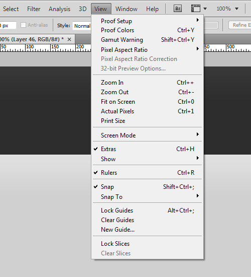
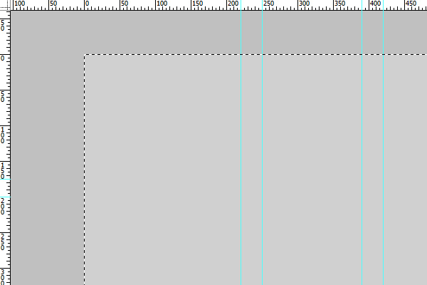
We now need to set up some quick guide lines to use later on in the design. Go to View > New Guide… > Check “Vertical” and type in the following values, pressing “OK” after each one to insert it. We want guide lines at 220px, 250px, 380px, 420px, 830px, 860px, 880px, 1155px, and 1180px.
Now let’s fill our background with a solid color. Select the layer “Background,” right-click on it, and choose “Layer from background” and give it a name. Now, using the Rectangular Marquee Tool (M), create a selection over the whole canvas and fill the selection with #d0d0d0.
Step 2
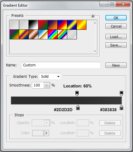
We will now create a header background. Create a new layer and call it “header”, then grab your Rectangular Marquee Tool (M) and make a selection at the top of your canvas spanning 175px high and fully across the canvas and fill it with any color. Double click on the layer you have just created and click on “Gradient Overlay” > existing gradient image > then set the right-most color to #383838. Position the left color at about 60% and change the color to #2D2D2D.
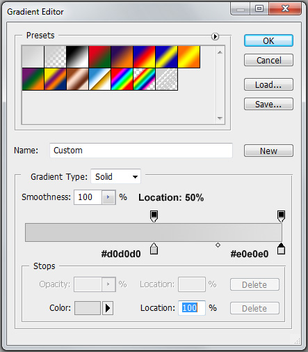
Now go ahead and duplicate the “header” layer and move it directly under the first header. Double click the layer once again and go to “Gradient Overlay” > existing gradient image > then set the right-most color to #e0e0e0. Position the left color at about 50% and change the color to #d0d0d0.
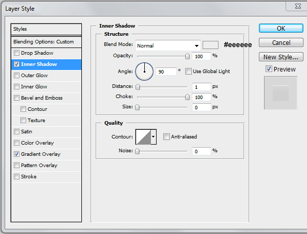
Now click on “Inner Shadow” and change the color to #EEEEEE, the opacity to 100%, distance to 1px, choke to 100% and size to 0px. Change the angle to 90 degrees and uncheck “Global Lighting” as we will be using different light angles throughout the theme.
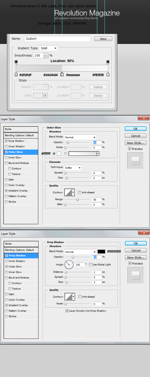
Now that we have the background all ready to go, let’s make a logo for our site! Create a new layer, about 40px from the top and ligned up with the first guide line, using the Horizontal Type Tool (T), type the name of your site in your preferred font (demo images display Helvetica Neue LT Std but regular Helvetica or Arial works just fine). Proceed to changing the Layer Styles as displayed in the example below.
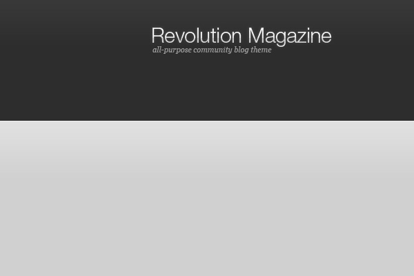
This is what your header should be looking like so far.
Step 3
A web site is nothing without a navigation, and a good one at that! Let’s now create a navigation bar that blends in with our existing header background.
Navigation
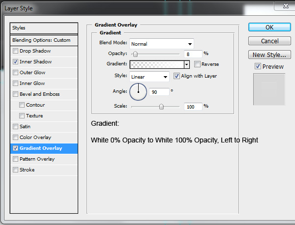
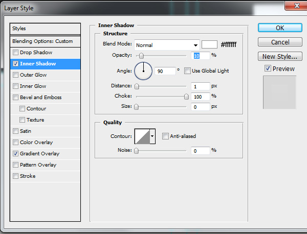
Create a new layer and call it “Vertical Gradient” and grab the Rectangular Marquee Tool (M) and make a 960px by 40px selection 115px from the top of the canvas, leaving about 20px underneath the selection for the background and fill it with any color. You can then add the Layer Styles shown in the image below to the layer you have just created.

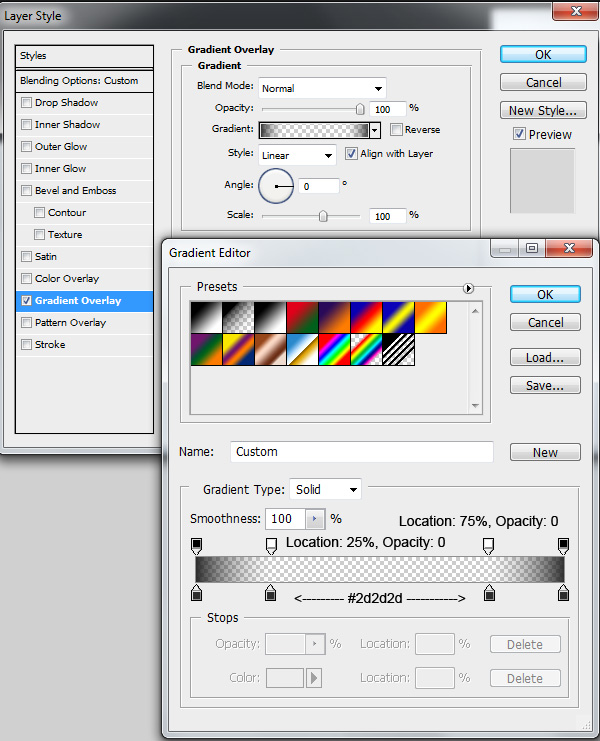
Now duplicate the layer you have just created and rename it to “Horizontal Gradient”. Change the Layer Styles according to the image below.
Finally, create a 960px by 1px line in a new layer called “darklight” right above the previous two layers and fill it with #1d1d1d. Your navigation should now look somewhat like in the image below.

Now let’s try making a custom “home” link button that will stand out from the rest of the links in the navigation. Create a new layer, and make a selection with the Rounded Rectangle Tool (U) about 50px by 60px vertically, filled with #444444, and fill in the bottom rounded edges so the selection is only rounded at the top.
Download this home icon, open it in Photoshop, and import it into your existing canvas. Resize it to about 18px by 17px and fill it with #999999. Center it in the previous layer you have made and now you have a stylish home link!
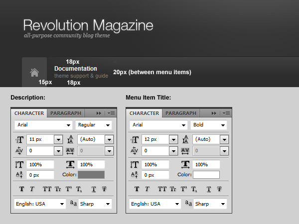
Next we are going to add navigation items to our navigation! Grab your Horizontal Type Tool (T), set the following styles below, and type in a menu item. In our example, the first item is “Documentation” with a description of “theme support & guide”. Add as many items as you’d like, leaving a padding of 20px between each menu item.
Social Media Icons
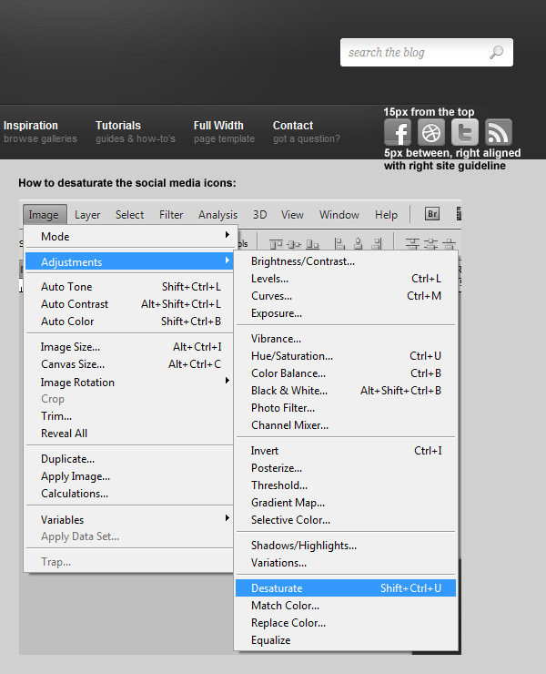
For the next step, we are going to need social media icons. We’ll start by downloading this set of social media icons, by KomodoMedia, and then placing four icons and desaturating them (Shift + Ctrl + U) like in the image below.
Congratulations! The header of our site is now complete! Let’s continue onto the body of the site.
Step 4
Now that the entire header is done, we are going to keep going on to the body of our site.
Main Body
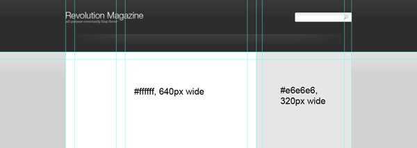
For starters, we are going to divide the body into two halves — one for the main body content and the other for the sidebar. Create a new layer, call it “main body” and make a selection with the Rectangular Marquee Tool (M) 640px wide and as tall as you want (at least 1000px or so), starting directly below the header background. Fill this selection with #ffffff. Now create a new layer, call it “sidebar” and make a selection 320px wide on the right of the “main body” layer and make it as tall as the main body. Fill it with #e6e6e6.
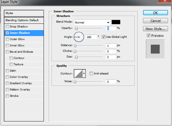
Next, we will give the sidebar a slight inner shadow on the left side to create an “indented” illusion. Add the Layer Styles below to your “sidebar” layer.
Featured Slider
Create a new layer and using the Rectangle Marquee Tool (M), make a 960px by 360px selection right at the top of our body, directly beneath the navigation and fill it with #e6e6e6. Create another layer and leaving a 25px margin on all sides, inside the previous selection, make a 910px by 312px selection and fill it with #ffffff. In Layer Styles, add a 1px #dddddd inner stroke on this layer.
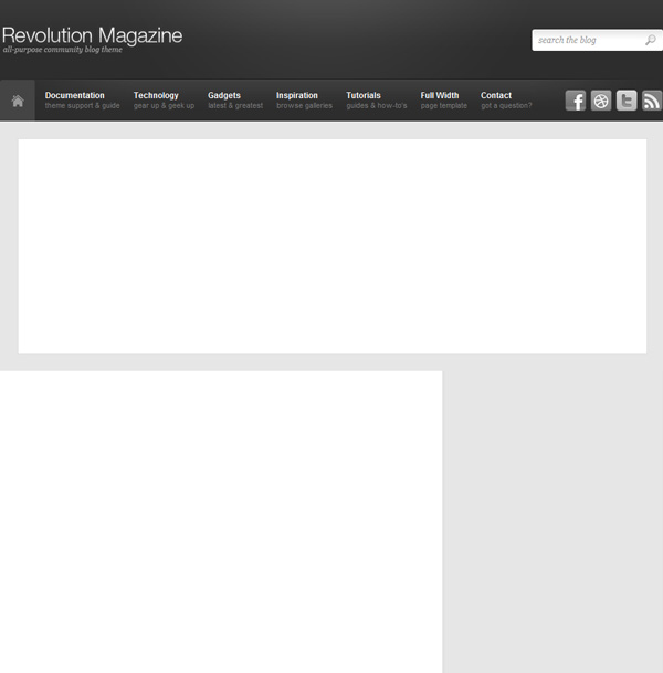
For the next step, we will need a sample image to use as a placeholder. Any image of anything will work so just find something that is 580px by 300px and put it in a new layer, fitting it 5px away from each side of the container we have just made.
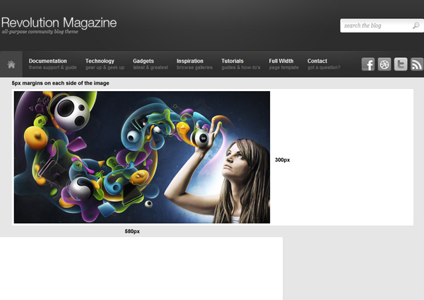
Create a new layer and call it “tab_hover”. Grab the Rectangle Marquee Tool (M) and make a 320px by 41px selection directly right of the image, in the top-right corner of the white slider container. Fill it with any color. Using the Polygonal Lasso Tool, click 20px left of the rectangle, exactly halfway in vertically and hold Ctrl while dragging diagonally up and right until you meet the rectangle’s top-left corner. Still holding Ctrl, drag down until you meet the bottom-left corner and finally, go back to the starting position. Fill this selection with any color.
Proceed to adding the styles shown in the image below to the “tab_hover” layer.
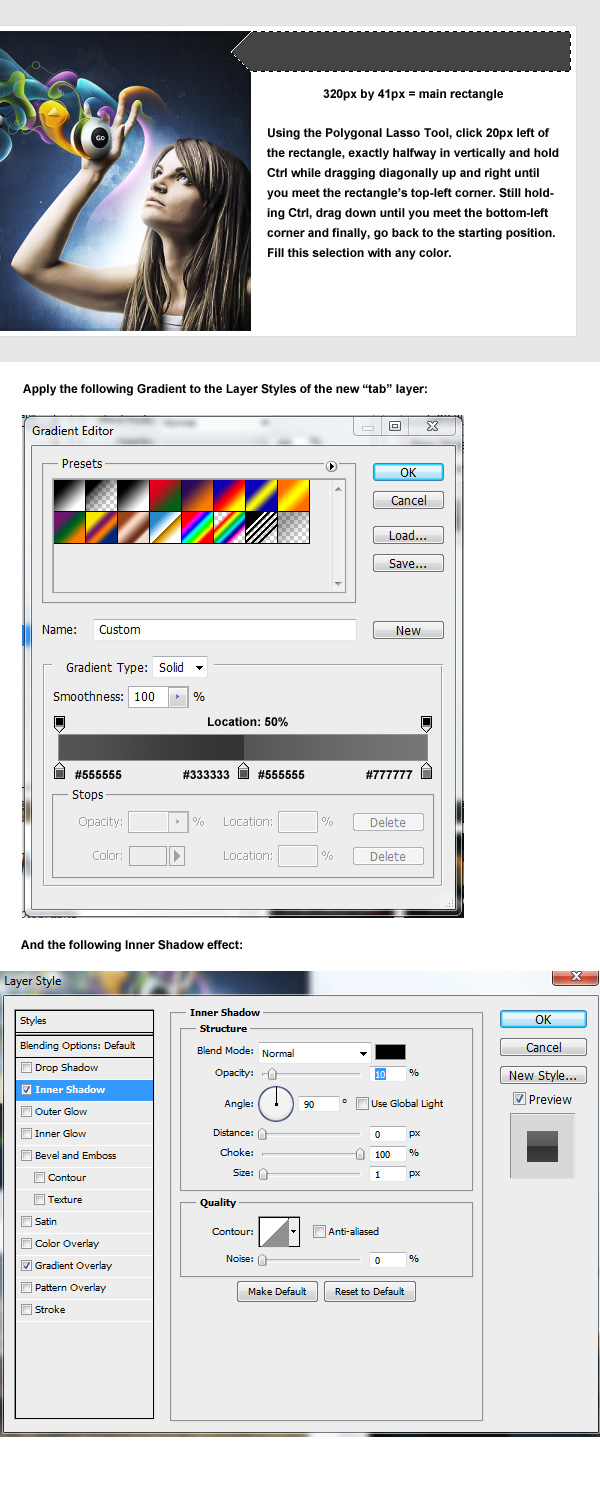
Now make a 320px by 92px selection with the Rectangle Marquee Tool (M) directly beneath the tab, put it in a new layer called “tab_space” and apply the necessary Layer Styles described in the image.
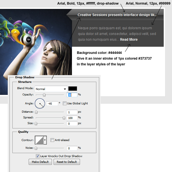
Now let’s repeat the steps to create the rest of the tabs, following slightly different styles in order to differentiate the “active” state from the rest of the tabs.
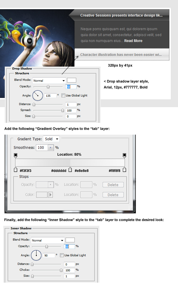
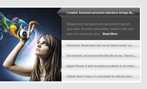
Finally, we should come up with something that looks similar to this and all ready to go!
Step 5
Whew! We’re almost there! With the hardest part out of the way, let’s continue onto the body of our site. In this step, we will discuss key techniques such as spacing.
Let’s begin our “Latest Post” section with a post. Let’s make a border by making a 615px by 210px selection with the Rectangle Marquee Tool (M), filling it with any color in a new layer called “border” and then adding a gradient described in the image below. As soon as we’re done with that, insert a 610px by 200px image, leaving 5px padding within the frame. The image is not important, so once again, you can use whatever you would like as a placeholder!
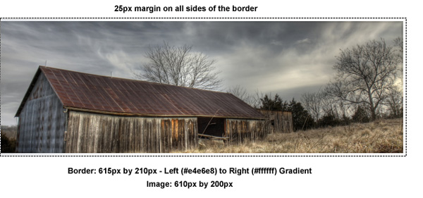
Proper spacing is essential in a successful design. Our community blog theme demostrates its strength in overall consistency and spacing by having congruent margins all around the post elements to help the reader’s eye easily flow down the page. Let’s take a look at how our post will look, with the help of some guidelines!
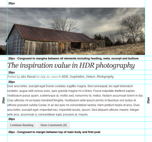
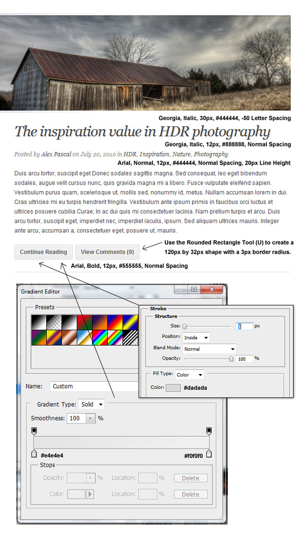
The next part is relatively explanatory. Using the Horizontal Type Tool (T), type out a heading, meta information, and excerpt for placeholders (you can use the text used in the demo image to save time) referring to the previous image for spacing and alignment help. Refer to the image below for text styles needed. Once all of the text is added, grab the Rounded Rectangle Tool (U) and make some quick buttons (approximately 120px by 32px), align them with the left side of the post and add the styles shown in the image below. You should now have an attractive post that you can duplicate over and over until you are satisfied!
Step 6
Almost as vital a part as any in a community blog theme, the sidebar! For demonstrative purposes, we will just design a few generic widgets — obviously it would be impossible to cover a custom design for every widget out there but most of these will allow the creative juices to flow to create more!
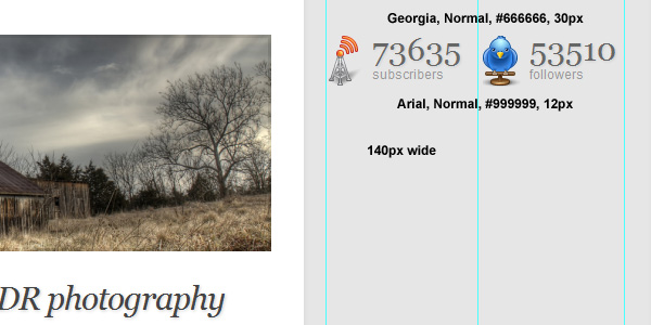
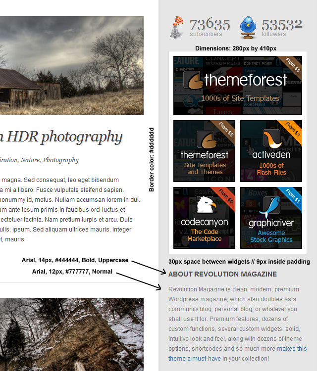
For this part, we will need to download the free Icon Pack from Graphic River and import the RSS 48x48px and Twitter 48x48px icons into our project. Position these icons 20px away from the left side of the sidebar and make sure they are aligned vertically with the first post on the left.
Grab the Horizontal Type Tool (T) and type in a random number for the subscribers and followers using the Georgia font, and the words “subscribers” and “followers” in Arial as described in the image below.
How about a simple advertisement widget? Sure! Grab the Rectangular Marquee Tool (M) and make a 280px by 410px selection, fill it with plain white, and give it an inner stroke of 1px #dddddd. Grab a couple of sample ads from Theme Forest and drop them into the new container, leaving 9-10px padding between each (depending on whether it’s between the border or between each ad).
Finally, type up a quick Text Widget with the Horizontal Type Tool (T) using the styles provided in the image below.
Grab the Rectangular Marquee Tool (M) and make a 280px by 225px container. Fill it with #eeeeee and give it an inner stroke of 1px #dbdbdb. New layer, make a tab about 84px by 37px in the top left corner of the container, leaving 4px padding on each side, then in the same layer create another 270px by 180px selection and fill it with white, creating a rectangle with a small rectangle sticking out in the top left. Give it an inner stroke of 1px #e0e0e0. Finish off the other 2 tabs, leaving 4px padding on each side at all times. Fill out the text with Arial 12px Bold. Make a 3px by 3px bullet filled with #bbbbbb and create as many items as you’d like.
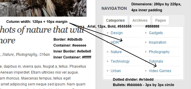
That’s it for the sidebar, let’s move onto the rest of the site!
Step 7
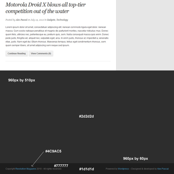
Now we’re slowly wrapping up this site with… you guessed it, the footer! Let’s prepare our footer by creating a quick background for it. Grab the Rectangle Marquee Tool (M) and create a 960px by 510px selection in a new layer, directly beneath the main body background. Fill this selection with #2d2d2d. This will serve as our footer with 4 columns in it. Directly beneath this block of color, make a selection 960px by 60px and fill it with #1d1d1d and put it in a new layer. This will serve as the “copyright” portion of the footer and a simple but effective way to signify the end of the page.
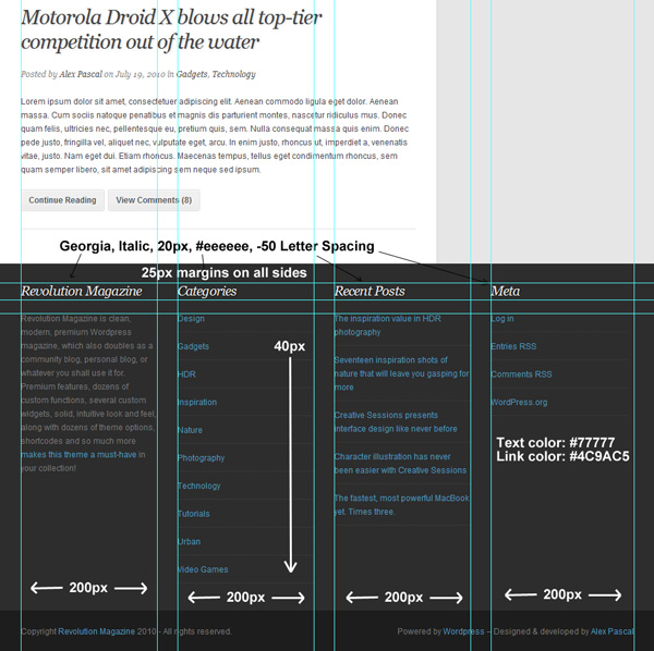
In our site, we will have 4 even columns in the footer, each 200px wide with a 25px margin between each one. To keep things uniform, we will also leave 25px at the top of our footer, after which we will have the headings of each column. Go ahead and grab the Horizontal Type Tool (T) and begin typing out the headings for each column, using the styles described in the image below. Leaving 20px underneath the headings, type out a short paragraph or a list of items separated by a simple “one pixel on, one pixel off” dotted divider.
Conclusion
Congratulations, you have just designed a clean, community blog theme in Adobe Photoshop. Hopefully you have learned some tips and tricks on how to design certain aspects of cleanly organized sites and are able to use these skills in projects of your own in the future!
As this is just a design tutorial, I haven’t gone into the theme-coding at all, but you can check out the Revolution theme at ThemeForest to see a live example.
Good luck and thanks for reading! ![]()


